Bar Graphs: Averages and Areas
Note: David wrote this book in 2010 so the figures are slightly dated but the overall points remain the same for the ideas that we are exploring.
While David makes the point that he didn't write the book as a response to discussions about climate change there is a natural connection. All that we are doing in the next set of plots is using the production of carbon dioxide as a indicator of how much energy a country uses. It allows us to notice certain differences among continents and countries that are meaningful. Yes there are inconsistencies but they don't change the overall meaning of the plots. France uses a lot of nuclear power which doesn't produce CO2 at all. China mostly powers with coal which creates more CO2 than other fuels. These are small effects that are mostly not relevant to the discussion.
Lets start at the biggest scale -- the world. Express in words what this plot says: (labels, scales, units)

What is the relationship between the 6 ton/CO2/p and the 34 GtCO2 for the world (34 GtCO2 is the area in the box). This assumes everyone is using energy at the same rate. This is the core idea of the average -- average assumed everyone is doing the same thing. If the average salary of a faculty member at COCC is $55k and there are 110 faculty what is the budget? Does everyone make the same amount? Is the average still helpful?
Proxy Data:
There is an important idea embedded in this data. At this time (2020) it is still true that the majority of sources of energy everywhere in the world come from fuels that produce CO2 as a by-product. This means that the amount of CO2 is directly related to amount of energy created and used. This is the meaning of proxy data -- CO2 is being used to track energy use even though it isn't exactly the same thing. In a similar way the percentage of positive COVID test results is being used as a proxy for how much testing is being done. The more testing that is being done the lower the percentage of positive test results one expects. It's not an exact connection but is useful and accessible data.
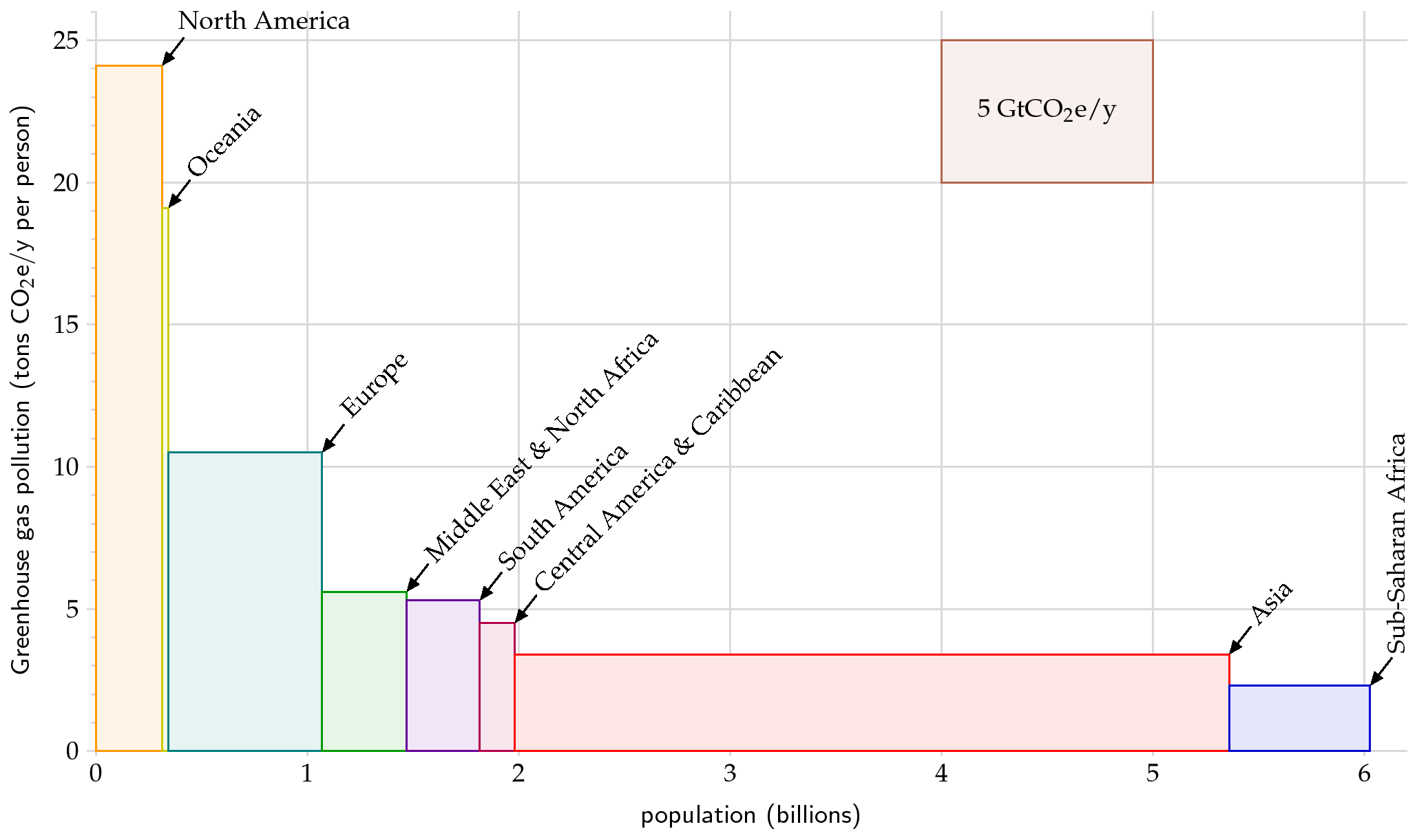
Now, what new things do we learn by breaking the previous plot down just a little? (labels, scales, units)

Given that CO2 is a proxy for energy use and energy use is a proxy for standard of living (from the plot on the previous breadcrumb!) you can see a general pattern that correlates with our broad global sense of standard of living. The total CO2 production for North America is the area of the first block on this plot. Looking at the scales that first block is 0.333 109 people wide and 24 tons of CO2/p/yr tall. The area is 8 Gtons of CO2/yr. Interestingly this says that North America produces about 25% of the total worlds CO2 and we only have 5% of the world's population. Could be argued that is a little unfair.
Practice Question:
If North America reduced it's use to 10 tons of CO2/y/p (giving up some part of our standard of living) how much could Asia raise it's standard of living?
If we reduce the height of the block for North America to 10 tons of CO2/yr/p ( the same as Europe currently) then the area of the block is 3.3 Gtons of CO2/yr (do the math and check). Thats a reduction of 4.7 Gtons of CO2/yr/p. If we were to add this to Asia that would raise the height of their block. Notice that the Asia block has a width of 3.3 109 people.
3.3 109 people x (height added) = area added = 4.7 Gtons of CO2/yr
A little algebra tells us that the height added is 1.4 tons of CO2/yr/p which might raise their average 'standard of living' to about 5 tons of CO2/yr/p which half what ours would be. Think about what this means -- If we reduced our 'standard of living' by more than half and gave all that resource to Asia they would only raise their 'standard of living' to half of our reduced standard. Powerful statement.
Activity: If Asia raised it's standard of living to be the same as Europe what would happen to world CO2 emissions assuming the energy sources don't change?
HW: Graph Calculations
Take the same starting assumption as the practice problem namely that North America reduces its 'standard of living' to that of Europe. If we gave all that energy to South America, Central America, and the Caribbean what would be their collective average 'standard of living' measured this way?
Broken Down Even More:
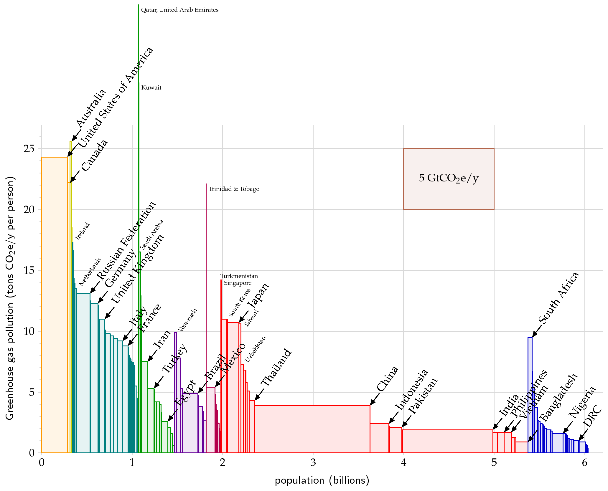
....and broken down by country? (labels, scales, units)

Does it matter if Trinidad and Tobago use a lot less energy? Why is South Africa so high compared to the rest of Africa? Which is a bigger global challenge from an energy perspective China or India? Why? Why would Australia be more like us and less like Europe? What questions does it provoke for you?
Slopes/Rate of Change:
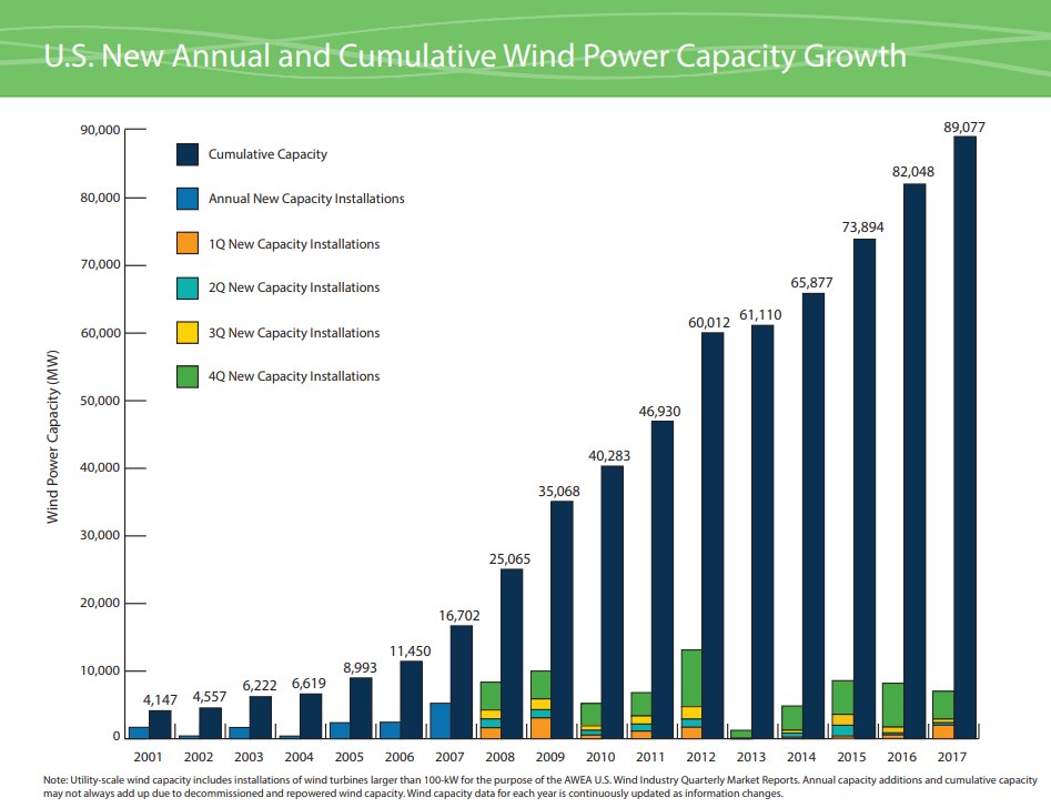
Look at this plot for a minute and apply our tools. What does this say and what does it mean for you?

Projecting Forward:
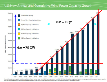
This plot represents data over about 15 years. One value of such data is to allow us to project the data forward. In words we often describe this as creating a trend line. We can use any tool to draw a line that represents the trend of the data from 2007 to 2017. This is not a formal 'curve fitting' process but rather a visual approximation to the trend in the data. Once the line is drawn then we need to find the slope of that line which is what will have meaning and value for us.

The red line feels like a good trend line (yours might be slightly different). To find the slope we need the rise and the run which form the red triangle. Projecting over to the axes we find numerical values of the rise and the run. Now we math it.....
slope = rise/run = 75 GW/10 yr = 7.5 GW/yr - Done!
What does this mean? If the trend continues as it has then every year 7.5 GW of capacity will be added. Projecting forward 3 years to 2020 this data would predict that an additional 22.5 GW of capacity would be added (7.5 GW/yr * 3 yr) for a total of roughly 121 GW of installed capacity. The data for 2020 is not in yet but it looks like we will hit 122 GW by the end of 2020 and we did hit 105 GW at the end of 2019 which is exactly what this data predicts.
General Questions:
Two things to notice about the data. The 4th quarter numbers are nearly always the largest. Why might this be? In addition something happened in 2012/2013. What was it that seems to have totally stopped the building of wind turbines.
In both cases it's all about tax policy:)
HW: Graph Calculations
In the Motivation chapter on page 7 at the top there is a graph that shows the population of England and Wales between 1600 and 1900 (the on the left in green). Answer these questions about the slope at different points on the graph
- What is the slope of this plot around 1700? Draw a line as we did in class and determine the slope.
- What are the units of the slope you calculated? Why is this called the population growth rate?
- What is the population growth rate, in England and Wales, around 1875?
- How are these two growth rates different (by how much?) and what explanation can you offer?
Assignment: HW Graph Calculations
Complete and assemble your solutions to all the HW problems listed here showing all the steps in your solutions. Scan to a pdf and turn in on LMS. Please review HW format expectations for guidance about your homework solutions.
Reading Ahead:
Next you will read the chapter on the Balance Sheet from David's book before we start the next discussion. This is a quick chapter that lays out the broad structure of the text and explains the core unit we will use to discuss energy use. Explore the Balance breadcrumbs. We will probably start into the chapter on Cars as well. Explore the Cars breadcrumbs as well.
