Now that we have some of the basics (math and unit conversion) introduced it's time to move on to a less familiar tool. It is hoped that you have read the chapter on Motivation from David's book before we start this discussion. This chapter is one of the longer chapters in the book so don't get worried about the future. Take your time and realize you may need to read through it a couple of times to feel comfortable and be sure you understand the purpose of the text.
Learning to Understand Graphs or Plots:
A central purpose of David's book is to address the challenge of scientific innumeracy. This is the concept that, by and large, many citizens don't really understand clearly how numbers describe our world and what they mean. There are many ways in which human beings are mislead by their own instincts or experiences. One version of this is the idea that if everybody does a little bit to help out we can make a big difference in the problem. This is based on the idea that if everybody contributed $1 to a fund and we gave that fund to one person that would make a big difference to them. That is unquestionably true. The assumption is that all of us making a small contribution can make a big difference to one person. Our energy problems are not like that. We collectively have an energy problem and if we each make a small contribution we only change a tiny part of the problem for each of us. Many challenges in society are of this kind.
Activity: Beijing hosted the 2008 Summer Olympics. Many athletes had concerns about competing in an environment that could look like that pictured below. What was the cause of this pollution and what did China do to mitigate the problem for the Olympics?

China closed factories and power plants for dozens of km around Beijing and banned automobiles in the weeks leading up to the event. Many/most of those factories and power plants were based on coal. They also worked to encourage rain by seeding clouds to cleanse the atmosphere. In the end, by dint of massive effort, they were able to clean up the atmosphere in Beijing for the duration of the Olympics. What you see in the image is a result of the choice of fuel for the energy needs of their economy and people. If they, and we, want to change where we get our energy it will depend on the numbers which is David's point.
This image is a simple graphic that communicates a broad point but very little data. On the other end of the spectrum is the Vostok ice core data. This data set from ice core analysis show direct and indirect measurements of the earth's atmosphere over the last 400,000 years. Compare what the plot describes to the current atmospheric concentration of CO2 at Earth's CO2.
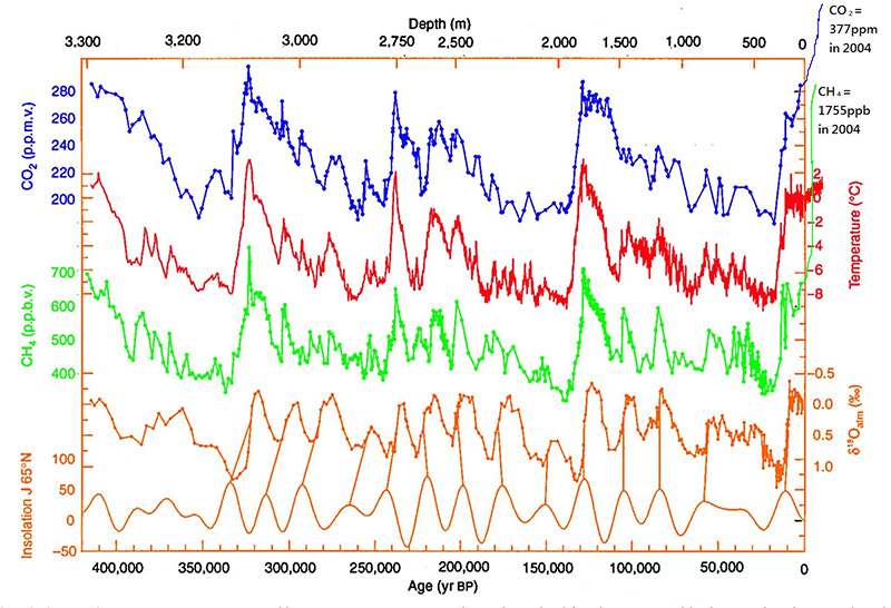
This is a complex plot with many different items of information. It shows correlations between a range of variables across an enormous swath of time. While there may be some basis for discussion about the way this data is generated there is little argument about the basic features of the data. On the other hand, there is so much data on this graph that it is overwhelming and hard to make sense of.
These two examples of graphical communication are a reasonable representation of the range of possible graphical information we might be called upon to interpret and understand.
Why Graphs at All?
Because we have very effective visual processing skills (a large part of our brain) presenting and understanding information in plots or graphs is a very important and effective skill. This skill is so important these days that there actual a career dedicated to this call a 'data scientist'. [The Visual Display of Quantitative Information by Edward Tufte and Dear Data by Giorgia Lupi and Stephanie Posavec are great examples!]
What are best practices when you meet a plot for the first time?
Consider this graph:
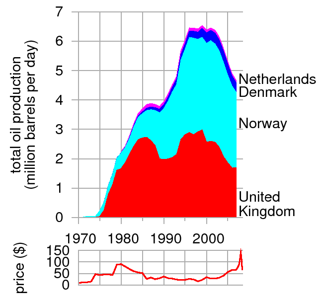
These are the questions to ask ourselves (generally in this order)
i: What characteristic of the world does each axis represent?
It is always worth taking a moment and making sure that what it says makes sense to us.
Here it is time on the horizontal axis and oil production on the vertical axis.
ii: What are the units?
This can be difficult if the graph uses a unit that is new to us or it may be some special unit used in the particular discipline of the folks who created the graph. At this point it is good to compare the unit to the characteristic being described to be sure they are consistent with each other
In this case the time is measured in years -- that seems OK. Oil production is measured in 106 barrels of oil each day. Not sure what a barrel of oil is but 106 is a lot of them (Mega). Might be helpful to note that 106 barrels/day is a rate sort of like km/hr is a rate.
iii: Are the scales linear? If not then what are they?
This is an important question that can easily distort how we interpret a graph. Linear scales are ones where the same distance along an axis has the same meaning at the begining of the axis and the end. For now we want to focus on is it linear or not. Later we will explore a particular non-linear axis called a log axis. Each axis need to be checked for linearity individually. Sometimes one is linear, sometimes both are linear, and sometimes neither is linear.
In this case, if we look at the horizontal axis, is the gap representing 10 yrs the same at each end of the scale? It is so the axis is linear. On the vertical axis is the gap representing 106 barrels/day the same at the top and bottom of the scale? Is is so the vertical axis is linear as well.
iv: Initial check for meaning:
Given that we feel that we understand what information is being presented it helps to do a little exploration to check that understanding. Consider your answers to these questions:
When did oil production start for each of the countries?
How much oil was produced in the first year?
Given that the Netherlands appears to start production in 1980 how do we reconcile the 2.2 106 barrels/day where it first appears on the graph. It doesn't make sense that they would start at a production rate that other countries took 10 years to reach. What could be wrong? This is how we know to be careful and consider the next possibility.
v: Is this a stacked graph or actual data?
We are so used to standard graphs in our math classes that this particular type of graph where the oil production is stacked on top of each of the other countries can be a little novel. The height from the bottom to the top of the graph is the collective oil production of all of the countries together. The height of each band of color, from the one underneath, is the individual countries production.
How do I figure out the oil production of Norway in 1985? (A little less that 1 106 barrels/day)
Did the oil production decrease or increase from 1987 to 1989? (it increased!)
vi: Explore the data presented?
Once you are pretty sure you know what the graph is all about and what is actually being shown it is time to explore the graph. This means looking for peaks, valley, steep parts, falling parts, and anything else that might be interesting.
In 2005 which countries had falling oil production, which seemed steady recently, and which were increasing?
Your Turn:
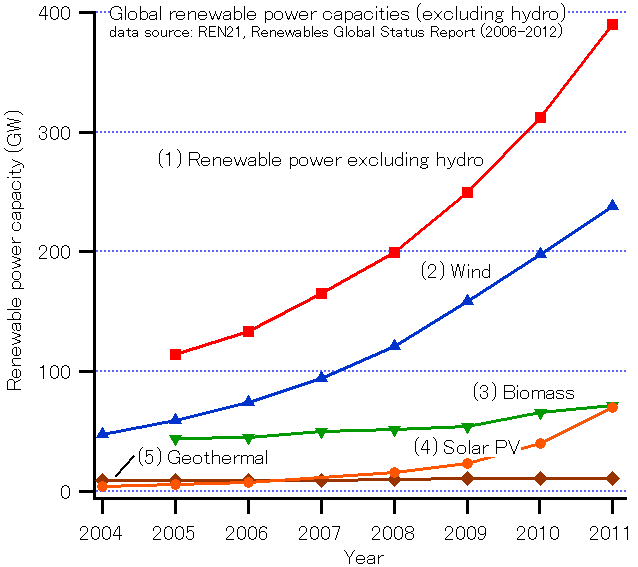
Activity: What about this graph? Go through each of the steps with your group. What was the total projected installed renewable capacity in 2010?
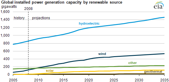
(roughly 1300 GW)
HW: Graphs
Answer the following questions about the graph below.
- What are the units (dimensions) that are being used on each axis?
- Is each scale linear or not linear?
- Is the production of energy by renewable sources rising or falling?
- When did we hit 200 GW of renewable energy production?
- Which form of renewable energy grew the most between 2009 and 2010?
Scatter Plots and Log Scales:
Sometime we encounter data where the individual data points are not connected in a clear and obvious way. It can still be useful to plot the data and seek for patterns (which is what science is right?). In this next example the graph/plot is showing each country in the world as measured by two characteristics.
Again, we start by applying the same steps as before:
i: What characteristic of the world does each axis represent? - GDP and power consumption.. what is GDP?
ii: What are the units? - $$ (understood) and kWh/d/p -- yikes, what is that (we will know in a week!)
iii: Are the scales linear? If not then what are they?
These scales are NOT linear by our definition. On the horizontal axis look at the first division (500-1000) and the 4th division (5,000-10,000). The divisions are the same size but one represents 10x the $$ of the other. On the vertical axis its a little harder to see but the gap between 10 and 20 is the same size as the gap between 100 and 200. Another power of 10x. This feature that the same distance on the graph represents 10x as much of the quantity is called a log (logarithmic) scale.
Why? Because if we graphed this data on a linear scale the data would be crowded in one corner and certain patterns in the data would be obscured. We do see a pattern in this data (trend up and to the right) and it represents really big differences between the countries. In this way log scales take really big differences and make them seem less significant.
iv: Initial check for meaning: - 3rd world countries are bottom left, 1st world are top right -- OK
v: Is this a stacked graph or actual data? - not an option with scatter plots usually
vi: Explore the data presented? - look around and think, what do you notice?
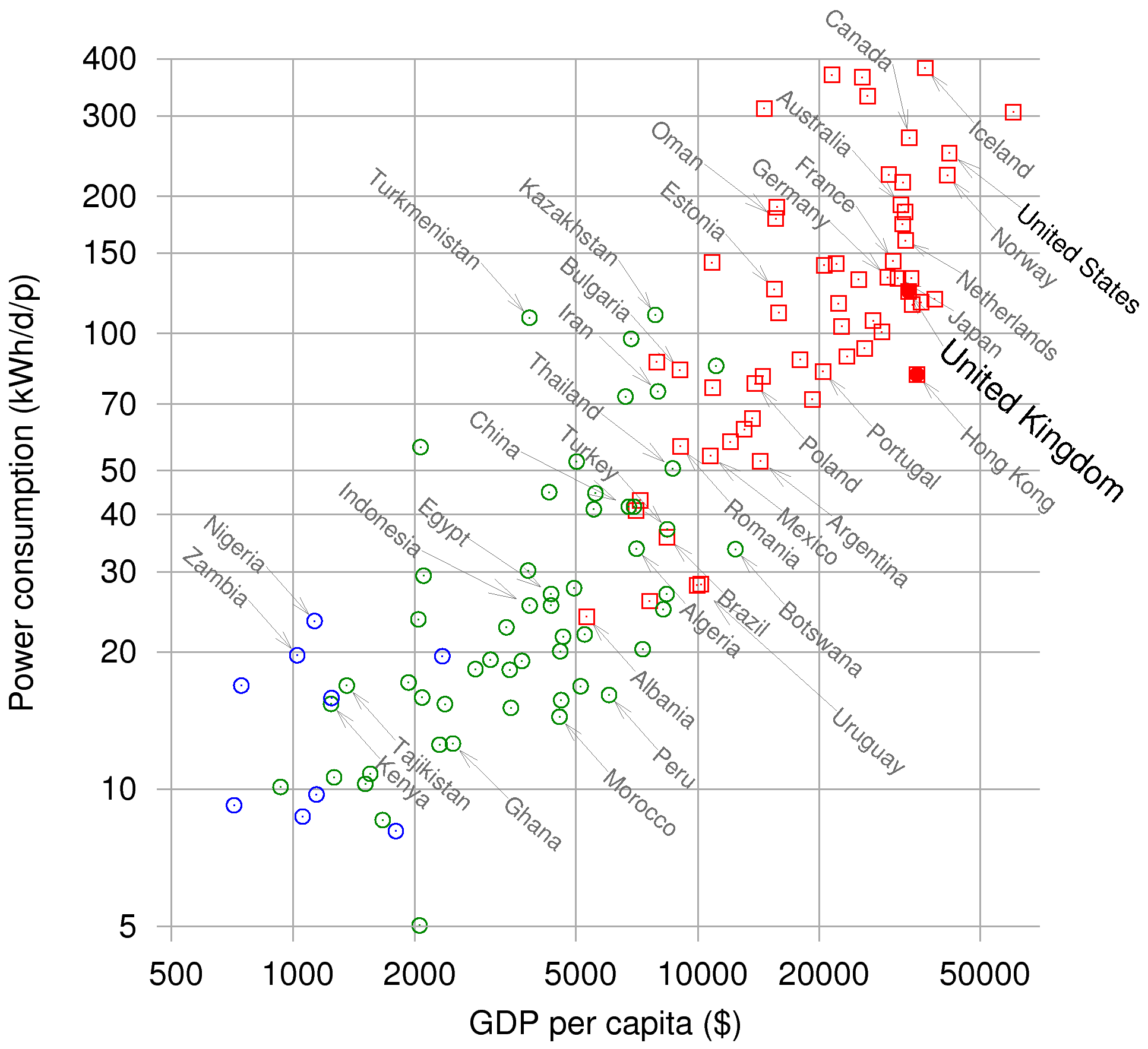
Log scales are useful when the range of data is very large. Such a plot tends to open up the data and make it more accessible. At the same time it misleads our eyes. When the distance between two data points doubles the actual effect changes by factors of 10.
HW: Graphs
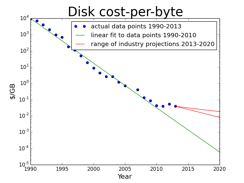
Answer the following questions about the graph below.
- What are the units (dimensions) that are being used on each axis?
- Are the scales linear or logarithmic? Which?
- Is the cost/GB rising or falling?
- What was the cost of for 10 GB of disk memory in 1995? ....and in 2010? You will need to do more than just read a number off the graph to answer these.
- What important difference does this graph indicate between the costs before 2010 and those after 2010?
We will have an interesting discussion about this graph next time.
Assignment: HW Graphs
Complete and assemble your solutions to all (2) the HW problems listed here showing all the steps in your unit conversions. Scan to a pdf and turn in on LMS. Please review HW format expectations for guidance about your homework solutions.
Reading Ahead:
Continue to read from the Motivation chapter from David's book as we continue our discussion of graphs. Read the Graphs II Breadcrumb to prepare for the next class.
