Solar Energy:
Reading to date:
At this point you have hopefully read the chapter on Solar energy from David's book before we start this discussion. This is a dense chapter that explores the basics of energy generation from various solar energy sources.
Forms of Solar Energy:
When we generate energy from the wind we nearly always end up with electricity as the output of the energy conversion process. Solar energy is relatively unique among renewable energy options in that we can generate useful energy in a number of forms. Solar energy can be used to generate electricity directly (PV panels) or heat (hot water or hot air), or high temperature heat (from which we can also make electricity) and biological forms of energy like food or biomass. This makes discussions about solar energy richer and broader than most other sources of energy.
Activity: Consider the different ways we can make use of solar energy which do you feel are most relevant to your life and which are most cost effective? Consider solar PV, passive solar heat, solar hot air, solar thermal, and solar biomass. You may be unclear what some of these are so ask your group.
HW: Solar
How would you describe the difference between the type energy gathered by solar hot water panels, passive solar energy gain, and PV panels? Think in terms of our earlier discussion about quality, portability, and storability of the energy.
Available Solar Energy:
The starting point for any discussion of solar energy is to establish how much energy is available and how that varies depending on your location on the earth. Here is a very nice web presentation of the various reasons that the solar energy that arrives at the earth from the sun is reduced when it finally arrives at the ground in different parts of the world. David summarizes this in the first part of the chapter. Here are the high points....
1400 W/m2 is the energy density of the sunshine that arrives at the top of the atmosphere. This is a result of the energy produced by the sun and our distance from it. This is reduced by the process of being absorbed by the atmosphere as it travels to the ground. Because of the tilt and shape of the earth sunlight has to travel through significantly more atmosphere to reach the ground as you go further from the equator. This effect is increased or decreased as a result of the seasonal tilt of the earth. There is only a small effect from the sun getting closer and further from the sun (not why we get seasons!) In a very general sense we often talk about 1000 W/m2 getting to the ground at noon on an average day as a way of getting a sense for the amount of energy available. Here's a plot of the solar energy available each day through the year at different locations. The units are different than I would prefer (they include the effect of the changing length of the day) so focus on the relative differences rather than the actual numbers.
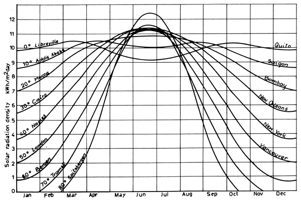
Part of what I'd like everyone to be conscious of is how many different ways this data gets presented. For our conceptual purposes we can overlook differences in the units but when we get down to calculating the energy we have to be more careful.
Activity: We all have a sense of where there is lots of solar energy and where there is much less. Consider Portland, Seattle, Bend, London (England), Phoenix, and Denver. How would you rank them as places to use solar energy AND roughly how much solar energy is available compared to Bend? 2x, 1/2, 10x or what?
Average Solar Power Available (by conceptual calculation):
It is important to recognize that the energy arriving from the sun varies from almost nothing at sunrise and sunset to a maximum each day around noon. Because this is such a complex system it is helpful to try and develop an average number which takes all of this into account and assumes that the sun shines all day and all night with equal intensity throughout the year. For my own explorations I often use the tools from pveducation.org that are referenced in the solar cell lab to get a sense of the data. Start with the conceptual idea that the peak solar energy is about 1000 W/m2 in the middle of the day in the summer and around 500 W/m2 in the winter. Add in the effect that in the winter the intensity of the sun dies away quicker through the day than it does in the summer in the summer. We can roughly estimate that the average intensity through the day in the summer is about 800 W/m2and 200 W/m2in the winter. This would suggest the across the year we could take the average intensity, during the day, is 600 W/m2. Now consider that in each day it's dark for half the time that would make the average intensity (assuming it's constant night and day throughout the year) about 300 W/m2. All of that assumes perfectly clear days. David points out that in England with a martime climate it's only clear about 1/3 of the day which drives the available energy down to 100 W/m2. Here in Central Oregon where we have lots of clear days you would only expect a small reduction in available sunshine to around 250 W/m2.
Take Home:
We would expect that average energy available in England to be about 100 W/m2 and around 250 W/m2 in Oregon
David's Calculations:
When David chases all the factors we explored above with greater care he arrives at a number like 110 W/m2 for his location in England which feels good when compared to our conceptual estimate. If we think about how much energy (kWh) is available we have to multiply this number by 24 hr/d which gives us.

A core feature of science is that we check our ideas and calculations against other data before we accept them. Here is a map of solar energy availability in the UK. The units on the map don't seem to match up with our number of above. Can you see in the labelling what the problem is?
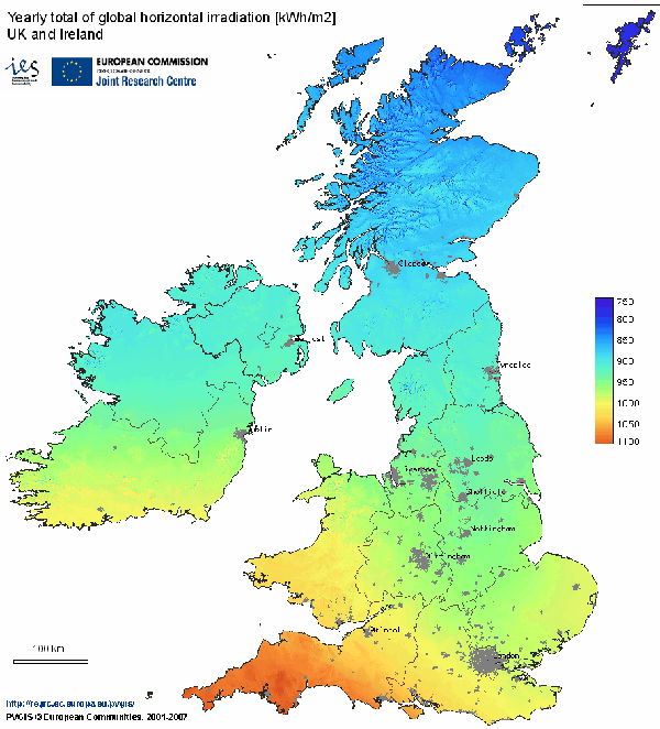
Our calculation is for one day and this map is looking at annual totals. Because our 110 is an average value for the whole year we can just multiply by 365 d/yr to correct for the difference.
![]()
..which looks about right for David's location northeast of London.
I know this feels like a lot of chasing around to just confirm that David's numbers are reasonable and in agreement with other sources of information but that is what we think of as best practices in science!
Bringing It Home:
Now, lets consider these maps of solar energy resources generated by NREL. You can find the full range of available maps from this NREL Resource page. As usual for new plots that we meet stop and look at the units and scales. Note that this data is for daily energy availability as opposed to annual.
Here's the US...
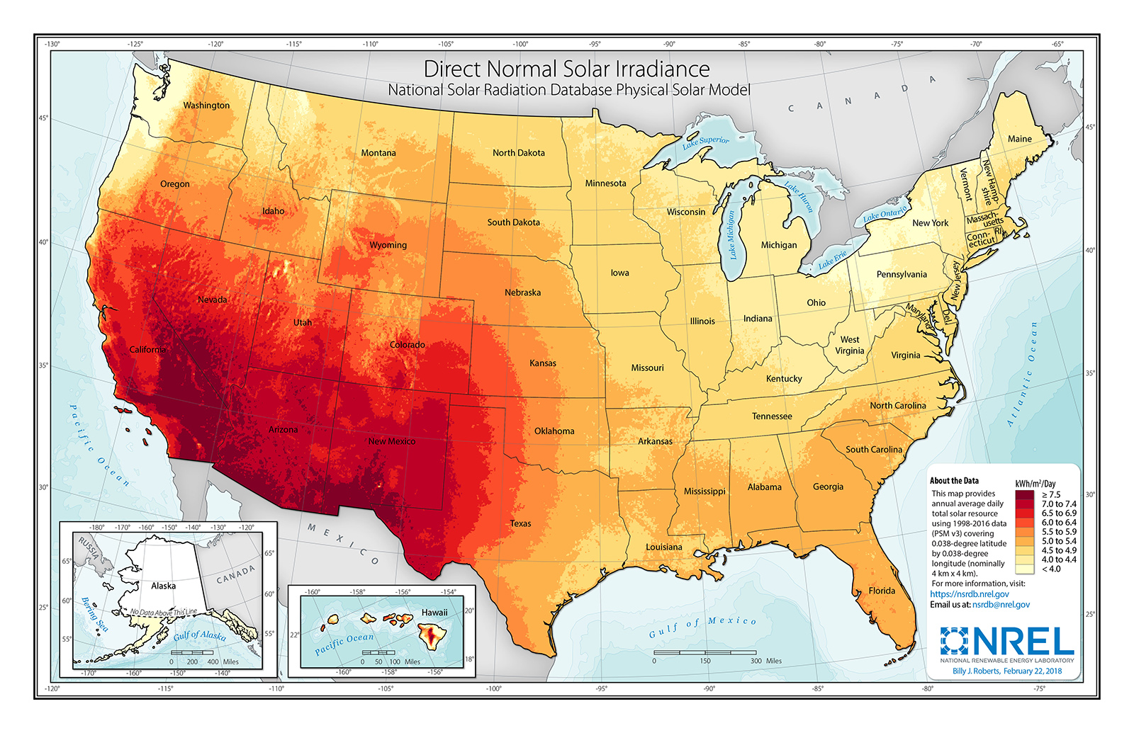
Where is the best energy resource for the US? How does it compare to David's calculation for the UK? How should we feel about that? In Oregon we have about 2 to 2.5x the resource of England and in the SW it's roughly 3x the resource.
Basically we should be very happy since we have a lot better solar energy resource than Britain.
HW: Solar
In Central Oregon we estimated (from the map above) that around 250 W/m2 of energy is available from the sun. Show me that you can figure this out for yourself by calculating what the average solar energy available in Seattle using the same map. Remember that we are comparing different units on different plots. This question is asking you to put all of the pieces together to arrive at a reasonable conclusion. Are you surprised by the answer you get?
How much energy can we make (reasonably)?
We will start by considering the opportunity to make electricity from solar energy with solar panels (called photovoltaic panels or PV panels). The first consideration that David addresses is their relative inefficiency. David suggests that we could hope for 20% efficiency but here's a plot of the many different kinds of solar cells. What do you think? The expense of these solar cells increases very rapidly as you move to the higher efficiency cells so that only NASA and other speciality applications can afford them.
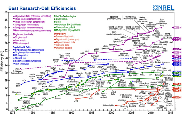
...but 20% seems good.
David starts by assuming we could afford quality PV panels (20% efficient) for our houses and cover 10 m2 of a south facing roof with those panels. Here's what that would yield in the UK...

..in Oregon things would go a little better for us here in Central Oregon...

Not insignificant but will it solve the overall challenge for either the UK or the US? Remember the UK uses about 110 kWH/p-d and the US uses 250 kWh/p-d at the moment.
Then David imagines that if we decide to do this at a commercial scale the efficiency of the PV panels would be more like 10% (a cost savings) and we might reasonably cover 5% of our share of the country with those panels. In the UK that means 200 m2 and in the US that means 1200 m2.

... and Central Oregon....

Now we're talking some real energy!! For the UK this is about half the need and for us in the US this is twice what we need. What does this mean for our overall discussion?
Is this realistic?
Given that there are solar PV farms in Europe and in the US are these reasonable numbers? Notice that David is assuming that he can actually generate 10 W/m2 in Europe (100 W/m2 * 10%) and we are assuming 25 W/m2 (250 W/m2 * 10%). Let's take a look at an actual solar farm and see how it actually works out.
The Topaz Solar Farm is in the desert in central California. A great location where the average solar energy available is certainly 250-300 W/m2. Looking at the data sheet on the wiki page we see that it has generated 1280 GWh/yr from an area of 25 km2. If you check the picture of the solar farm it does appear that the area includes the gaps between the different sections and is an honorable estimate of the total area. The data provided on the wiki page also notes that the capacity factor is about 26.6% which means the actual power generation is 146 MW (nameplate capacity x 0.266 = 550 MW x 0.266) over the year.
Two things to note here. The capacity factor is very much the same as it is for wind farms which is a useful thing to know. That means that the actual power generation for both wind and solar farms is only 1/4 of the nameplate capacity.
The second thing is that this makes it easy to figure out the power generation efficiency in W/m2. We just divide the 146 MW by 25 km2 and do a little unit conversion and we're there.

This is typical of the numbers that David gets for solar farms in Europe and a lot less than we were expecting for the US. 6 W/m2 is 1/4 of what we were expecting. This suggests that we would only generate 720/4 kWh/day here in the US which is still 180 kWh/d. Not everything we need but pretty close.
All in all it still looks like the US is in great shape to use solar PV farms to meet our energy needs.
Take Home: 5% of the area of the US covered in solar farms will produce about 180 kWh/p/d!
How Much Have We Built?
We have pretty clearly established that we could meet our needs in the US with a lot of solar farms. Things are less rosy for David in the UK. The next obvious question is 'How are we doing?'. Are we building solar farms fast enough to make a difference sometime soon? As you may remember from our discussion about wind farms our total power generation needs for the US at 1.1 TW.
Because of the 26% capacity factor we need to build 4 times this much nameplate capacity. That means we need 4.4 TW of nameplate capacity to meet our national needs. The data for installation of solar PV systems is usually reported as annual installations and not cummulative installations. We're interested in the cummulative installations and that data was harder for me to find Here's what we've been building for solar PV farms until 2017. Notice that the vertical scale is in thousands of MW which is essentially GW. Everything after 2017 is a projection in this plot. In 2017 we had 40 GW of installed capacity.
This is an interesting plot because there is a clear suggestion that the rate at which we are installing solar PV is increasing. From 2014 to 2017 it increases by about 25 GW/3 yrs which is an annual rate of 8.3 GW/yr and their projections look like about 9 GW/yr.
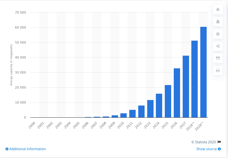
If we need 4.4 TW which is 4400 GW and we're building solar at 8.3 GW/yr we're in for a long haul. At that rate it will take 528 yrs to build what we need. Not great and a little worse than the situation for wind. All the same considerations that we applied to wind apply to solar in that if we increase the rate of construction or reduce our needs or only aim to meet half our needs the time reach our goals can drop significantly.
HW: Solar
Given that current solar farms like Topaz generate energy at about 6 W/m2 how many m2 of solar farms we will need to build to meet half our energy needs? Is this area bigger or smaller than the State of Oregon? This problem requires that you combine information from different parts of this breadcrumb and use dimensional analysis (units) to figure out what to do with those numbers. Think it through conceptually before diving in.
Assignment: HW: Solar
Complete and assemble your solutions to all the HW problems (3) listed here showing all the steps in your solutions. Scan to a pdf and turn in on LMS. Please review HW format expectations for guidance about your homework solutions.of
Reading Ahead:
Next you will read the chapter on Solar: Tech from David's book before we start the next discussion. Here we explore some other variations of utility scale solar energy that have some real potential.
