Plans That Add Up:
David suggests these 5 plans as examples (not pushing one or the other) as a way of approaching the question of how the UK might meet a goal of generating it's energy with renewable resources. Note that they all 'add up' to the reduced energy consumption that he proposed earlier in his book.
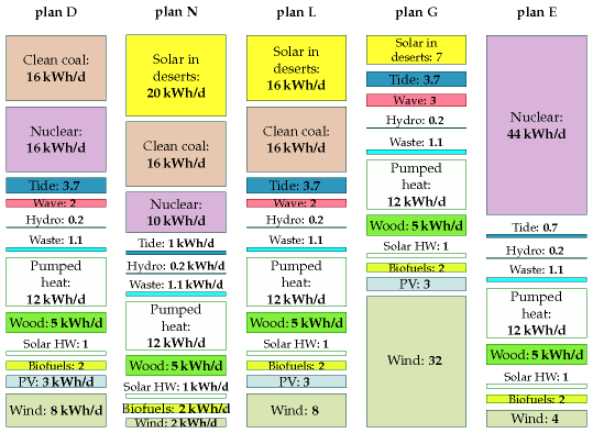
You'll notice that they actually represent a complex mixture of different approaches including significant reliance on 'clean coal', nuclear power, and solar power in other people's deserts. What commonalities do you see and what are the core differences between the plans?
In the case of the US things seem simpler to start with because it is clear that there is indeed enough renewable energy potential to meet our needs with just wind and solar. Let us go on and explore a more careful thought out model for how things might play out for the US.
HW: Can Do II?
If you were a citizen of the UK which plan would you prefer and why?
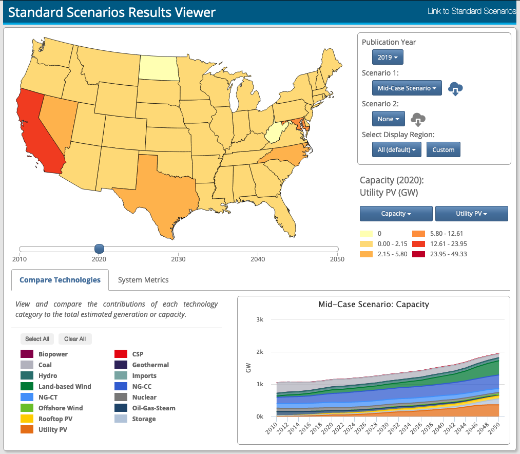
The folks at NREL, as usual, have spent a lot of effort working to understand our complex energy system and it's possible futures. Their analysis is updated every year and offers a large range of possible scenarios that would potentially affect the way in which this country might move towards the future with renewable energy. We will explore some basics of this model viewer so you have a sense of how to use it. The image below shows a version of the landing page for the viewer:
Target:
After confusing myself a lot with this data I finally sorted out the situation. This tool only addresses the question of electricity generation and NOT all the other forms of energy used in the US. If we look at our Sankey plot we generate 12.7 Quads of electric energy annually which turns out to be right around 4000 TWh of energy each year. From the same data set we see that our inputs are almost 38 Quads which is equivalent to an average input (nameplate capacity) of 1.2 TW. Notice that the NREL model makes various predications about how much our use of electricity will grow over the next 30 years including various scenarios for vehicle electrification.
Core Message: This tool explores our current and future use of electricity NOT other sources of energy.
Exploring Predictions: LLNL Sankey plot for reference
Lets first talk about how to explore the outputs of this predictive tool. The various scenarios represent different possible futures based on expectations of what gets cheap or expensive. We will use the middle of the road scenario called the Mid-Case Scenario to start with. We can select what energy characteristic to plot using the drop down menu in the middle right of the viewer. The graph in the bottom right of the window shows the mix of different types of energy generation as a stack plot of the energy characteric we have chosen. If we choose to show Generation (Generated Energy in TWh) the stack plot will show total projected energy use until 2050. What do you notice about how much growth is projected?
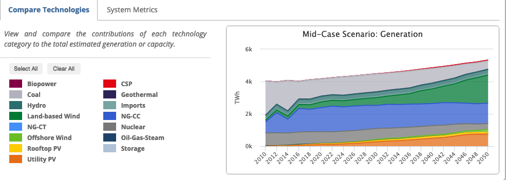
Individual Contributions:
If we plot the capacity (installed capacity) we can see the contribution from land based wind generation by choosing 'Clear All' and then selecting land based and offshore wind to display. What you see below is that the model is correct for 2019 (compared to the wiki we consulted previously) with about 105 GW of installed wind capacity. It also indicates a low expectation for offshore wind as a significant contributor to our electric energy generation by 2050. Given the data below what is the average rate at which the model suggests we will build wind power capacity?
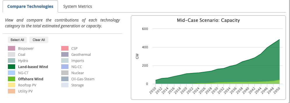
The projection suggests we will make it to 500 GW of installed capacity by 2050 (30 years from now). We are currently at about 100 GW of installed capacity. The rate of installation is given by:
rate = change/time = (500 GW - 100 GW)/30 years = 13 GW/yr
If you look back at our discussions about wind generation we are currently installing about 10 GW/yr so this model doesn't imagine we will do a lot better than that over the next 30 years.
HW: Can Do II?
What is the projected rate of growth for Utility Scale PV (solar farms) in this model? How does it compare to our current installation rate of 8-9 GW/yr?
Where:
If we look at the map in the top left of the viewer we can look at where wind power has been installed across the country. By moving the slider showing the year we can see where the model projects most of the wind power will be installed. Consider the projection for 2050 shown below.
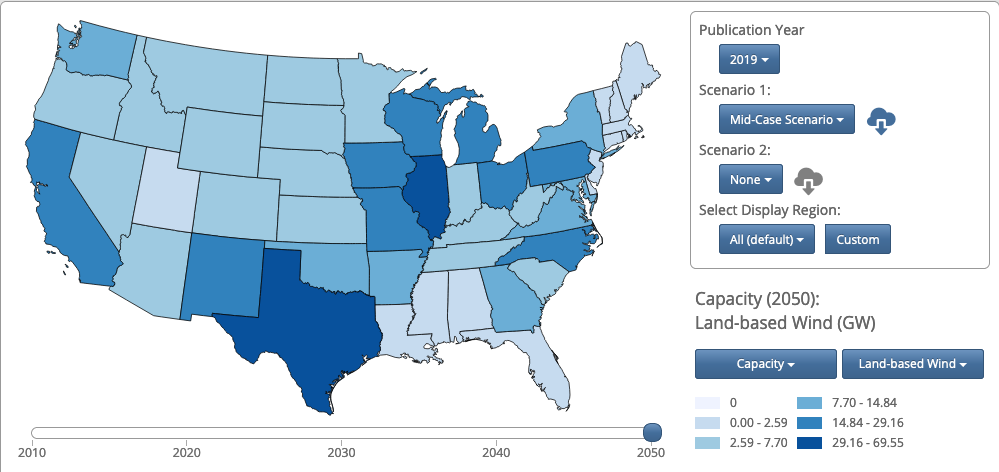
Why do you suppose the model projects Illinois to be such a major player in the future of wind energy? What else is expected or unexpected about this data? Are you surprised that Wyoming, S Dakota, Nebraska, and Kansas are relatively low? Why might that be?
HW: Can Do II?
What are the projected locations for Utility Scale PV (solar farms) in this model? There are some surprising predictions both in terms of some states that have more utility scale PV than you might expect and others that are surprisingly lower. Which are higher than expected and which are lower? What might be a reason for this?
Cost of Energy:
A last modest exploration. Part of what makes all these predictions complicated is the many ways the price of different forms of energy might change over the next few decades. Natural gas provides about 30% of our current energy needs and it is relatively inexpensive. What would you expect to happen if natural gas got expensive and renewable energy (wind and solar) got even less expensive? In the viewer we can choose just this scenario and compare it to the Mid-Case (pragmatic) projection. Here is the projected wind and PV for the Mid-Case.

....and now with high natural gas costs and low renewable cost....

Under this scenario the model projects nearly twice as much installation of wind and solar PV which makes sense.
Plotting these according to the fraction of our energy needs wind and solar PV would provide here is the Mid-Case scenario. This suggests that the pragmatic prediction is that we might meet about half our needs (0.5) for electricity with renewable energy by 2050.

In the more optimistic scenario (for renewables) where natural gas becomes expensive and renewables continue to drop in price we might meet 70% (0.7) of our electricity need this way.

There are endless scenarios to explore here but what I would want you to take away is that there are many factors at play that affect the choices we will likely make as a society.
Assignment: HW: Can Do II?
Complete and assemble your solutions to all the HW problems (3) listed here showing all the steps in your solutions. Scan to a pdf and turn in on LMS. Please review HW format expectations for guidance about your homework solutions.
Reading Ahead:
We're basically done -- there is no more reading ahead -- Yay!!! Lots more to read if you want to dig deeper into David's book. All the other chapters are linked on the text pdf page to make it easier to access them.
