Mood Brightener: ...more from Stay Homas. (Confination V)
Plots: Why?
Why does science go on and on about using plots to convey information? There are reasons that have to do with the practice of science and the numerical information we are working to communicate. Underneath all that there is a human reason that we usual visual tools to represent information. You can take a look at this sample lecture on Data Visualization from Coursera for a quick 5 min overview of the connection between our brains and how we respond to visual representations of information. A quick summary would be to say that we are primarily visual creatures and as a result dedicate a significant portion of our brains processing power to interpreting what we see. Numbers and written data are more abstract and it takes much for effort for us to detect patterns and understand the this sort of data even though it is often more precise.
Given that our understanding of the human brain and the way it processes information is relatively recent and many many questions remain it is not surprising that the field of data visualization has evolved dramatically over the last few decades. Eduard Tufte is an important figure in this rebirth and you will see his books on data visualization on the book shelves of many of your math and science instructors. If you are interested in how data is presented you could do much worse than reading his set of 3 classic books.
Plots, graphs, data visualizations (data viz in the trade), and data representations are only some of the synonyms we use to describe this mode of communication.
Examples:
While you may have a specific example that comes to mind when I use the word plot or graph there are a huge range of these objects from very simple to very abstract and everything in between. This first example is relatively straightforward plot from a math class.
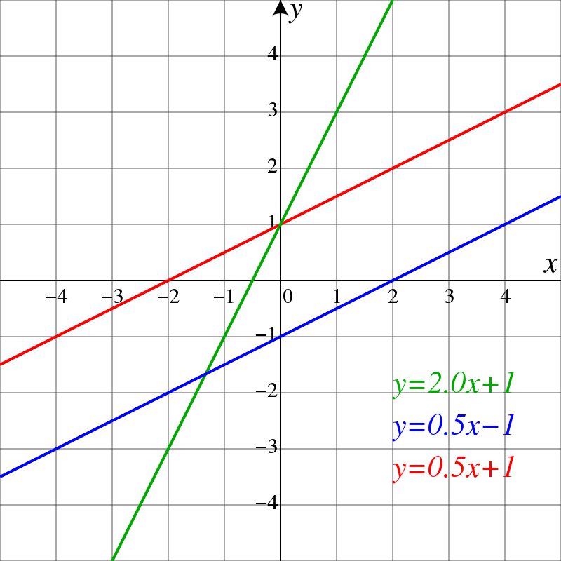
By ElectroKid (talk • contribs). Original: HiTe. - Modification from the original work., CC BY-SA 1.0, Link
Here is a more complex graph called a histogram from David MacKay's book Sustainability without the Hot Air ...

and another...
Sometimes, in an attempt to get a lot of information out there it can be pretty overwhelming...
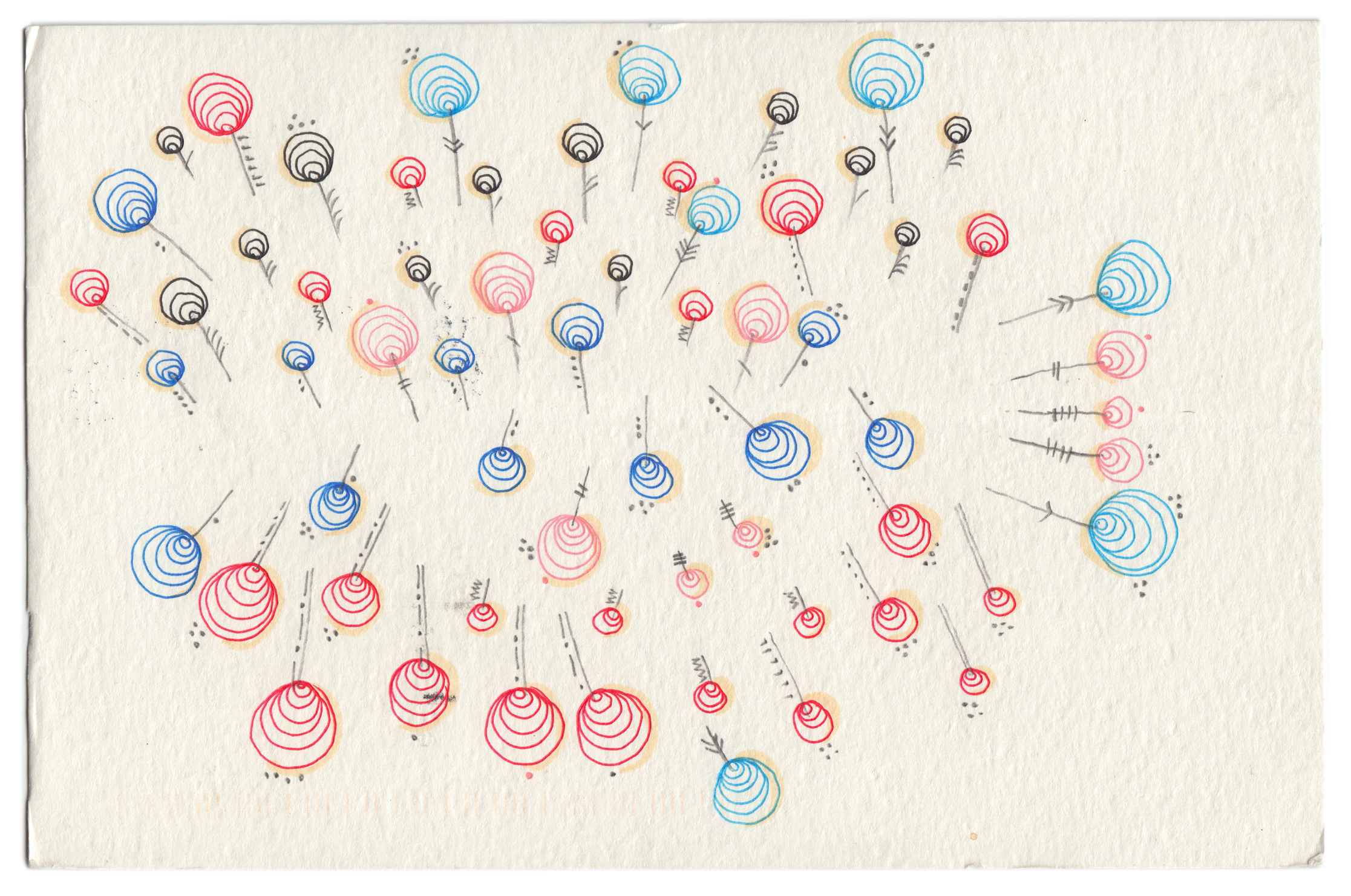
Plots/graphs can also get quite abstract and seem more like art than anything else. There is a lovely project called Dear Data (Giorgia Lupi and Stefanie Posavec) which produced some fascinating visualizations like this one....
So....what's my point? Like everything else in this class my point is that what seem like simple concepts and statements are usually much richer and deeper than they first appear. It is not my intent to intimidate but rather to remind us all that there are an staggering range of choices when we are seeking to communicate data.
How to approach a new plot/graph/vizualization in the wild!!
If we're talking about plots and the visual representation of data in the summer of 2020 we really have to use the plots/representations that we see almost very day about the progression of COVID-19 (the disease) and the SARS-CoV-2 (this is the virus!) around the world. Here is an important plot that has been part of this discussion and is a good place to talk about how I would like you to approach any plot that you meet for the first time.
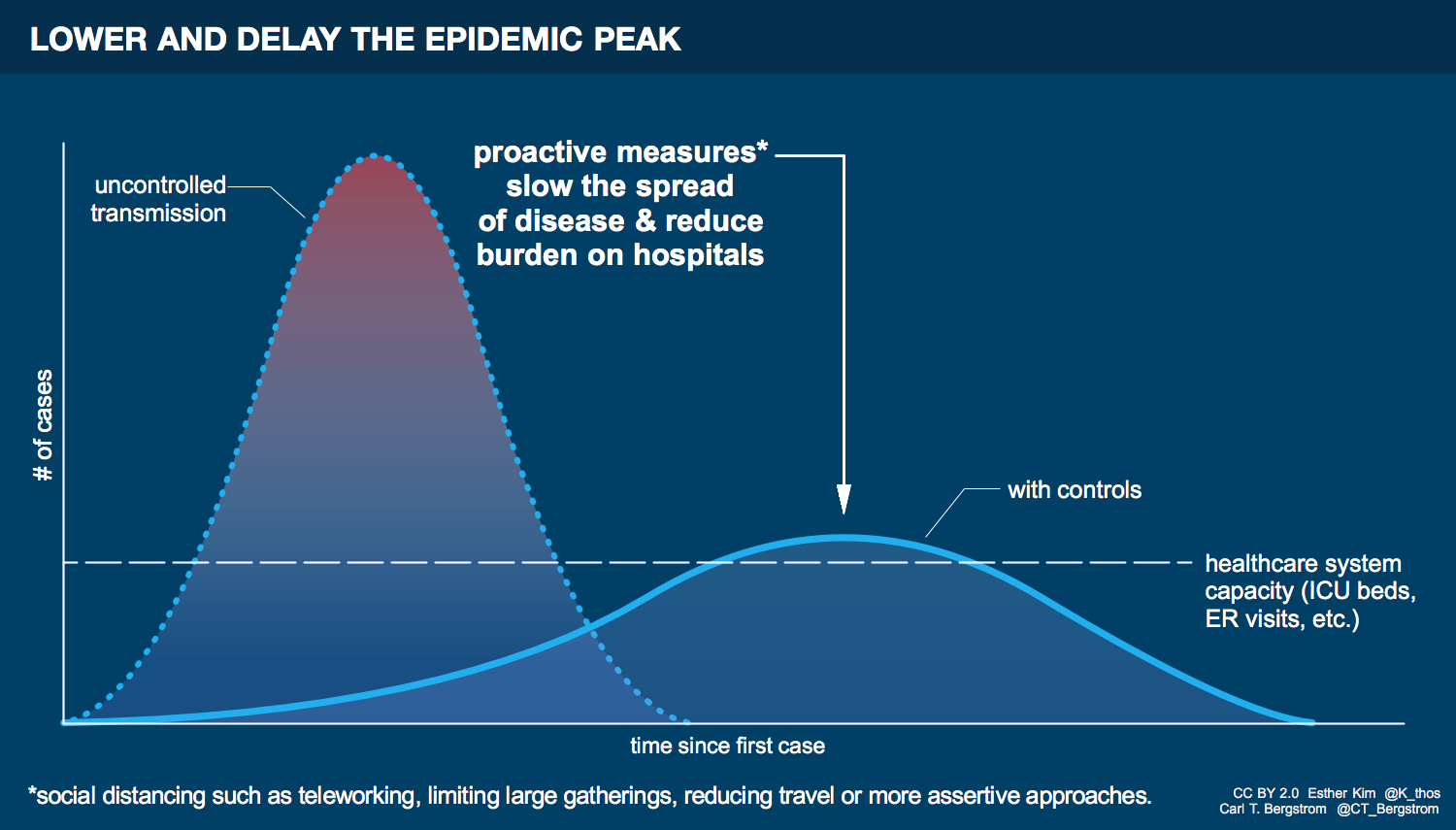
This plot is one of the ones that has been widely shared as we have learned to understand the public health concept of 'flattening the curve'. This particular version comes from Esther Kim & Carl T. Bergstrom and is shared under a Creative Commons license. Here are the steps I'd like you to take in addressing any plot:
i) The first step in considering any plot is to look the axes (plural of axis) and the labels on the axes. The questions to ask yourself are what is being represented on each axis, what are the units, is the axis numerical or qualitative, is the axis linear or non-linear (usually logarithmic). How would you answer these question for the graph above?
ii) Consider the area under the curve. What does that area represent? Be careful - sometimes the area has no clear meaning although in this case it does! If there are multiple curves are the areas the same or different? This can be difficult to determine visually but one can alwas try. What does the area under each curve represent in this case? Do you think the areas the same? What would it mean about what the plot is communicating if the areas are the same or if they are different? Do you understand why this is an improtant part of the national discussion we are having?
iii) Consider the slope of the curve(s). Slopes are often referred to as 'rates of change' particularly when one of the axes represents time. Conceptually the slope is still a rate of change even if there isn't a time axis. The rate at which the ground is going down depends on where you are on the mountain as an example. In this example what is different about the rates of change before the peak on each of the curves? What is the difference in the rates of change after the peak? Is there a difference between the rates of change AT the peak?
I agree that this is a slow and careful way to approach a new plot and we often just glance at the plot and decide we know what it means. This is the difference between fast and slow thinking as discussed by Daniel Kahneman in his book Thinking: Fast and Slow. From a science perspective taking a slow and methodical approach to complex information is necessary to make effective sense of it.
We will go to the John Hopkins COVID data website and explore some of the features of the graphs there to ilustrate some of the challenges in making sense of the data. In particular we will look at some of the state by state data and some of the international data.
If you are interested in digging into this particular set of visualizations further I recommend this podcast episode from Data Stories.
Assignment Breadcrumb Reading: Bb Assignment
Energy Use:
Consider the histogram from David MacKay in the early part of this discussion. The vertical axis is labeled as tons of CO2 per person per year. Because even our electricity comes from burning natural gas or coal the CO2 produced is a good measure of the energy we each use during the year. Find the US and Germany on the chart. What is the difference in the energy use between German citizens and US citizens? Do you think that if you were living in Germany would you feel like your standard of living were less by a similar proportion? Explain your reasoning.
Before Next Class:
Assignment HW: Bb Assignment
Flattening the Curve:
In the original discussion of 'Flattening the Curve' the plot from Kim and Bergstrom (or one much like it) was commonly used to explain the concept. Can we tell from our actual data how much we have 'flattened the curve'? Can we tell, for some states, that we did 'flatten the curve' for at least some time? I'm asking you to think carefully and distinguish the 'how much' question and the 'did it happen at all' question. In each case explain your reasoning.
Assignment HW: Bb Assignment
Importance of Data:
Here is a link to Oregon's COVID data dashboard and here is the current tracking data for Oregon. Compare this to the John Hopkins data for Oregon (you may have to select Oregon from the drop down menu). Do the two data sets agree overall? Is there evidence that Oregon did 'flatten the curve'? What do you make of the differences in the data from last week or so? Would you interpret the graphs similarly?
Looking Ahead:
Look ahead to the next Breadcrumb: Rates/Speed
Assignment Breadcrumb Reading: Bb Assignment
Growth in Daily Cases:
Given that the slope of the new daily cases in Florida in the middle of June (222 cases/day each day) is about twice what it was at the end of March (118 cases/day each day) should Floridians be more worried, less worried, or about the same as they were back in late March? Explain your answer based on the data you see on the plot and our calculated slopes.
