Mood Brightener: ...more from Stay Homas. (Confination VI) - this is the one that got them noticed in this country:)
Rates (slopes): How do we figure them out?
We talk a lot about rates in our daily life and the world has been throwing around rates, including R0, these last few months. For the purposes of this class and science generally I want to get a little more specific about what I want. In part because the R0 you've perhaps heard about is a different kind of rate that we are not going to deal with mathematically. Let's return to this graph from the previous breadcrumb.
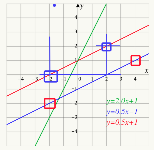
When we are presented with a data plot in science we approach it, perhaps, slightly differently that one does in a math class. A slope is conceptually defined as
slope = rise/run (where rise is vertical and run is horizontal)
If you consider the red line I am going to pick two points on the line from which to calculate the rise and the run. These two points are boxed in blue -- there is nothing particularly special about them except that it's fairly easy to determine what their values are since they go right though the grid intersection.
Note: This idea that I can pick any two points on the line is one that is often confusing for students who are used to using the specific data points from a math problem. What is important to us in this moment is the slope of the line and not the particular data points. To find the slope I need any two points on the line and it seems prudent to pick ones that are relatively clearly defined and 'easy' to work with.
The two points I have boxed are at [-2,0] and [2,2]. The rise is the difference in the y values (rise = 2 - 0 = 2) and the run is the difference in the x values (run = 2 - (-2) = 4). The tradition is that we subtract the leftmost point for the rightmost point but be aware that every now and then somebody does it differently for a specific reason. In this case if we divide the rise by the run then the slope is
slope = rise/run = 2/4 = + 0.5
We generally assume that if the slope is positive the line is rising to the right and if the slope is negative it's falling as the plot moves to the right. Use the points boxed in the red squares to show that the slope of the blue line is also +0.5. Notice that the red and blue lines are parallel which means we expect them to have the same slope. For practice you can pick two points on the green line and determine the slope (+2.0 should be your answer)
What to do when the line is not so straight?
No real data is as straight and lovely as those lines we see in math class so lets look at some more actual data. Note: I am using the John Hopkins Corona Virus data set since there is some evidence that this is a relatively reliable data set. Here is the COVID case data for Florida (updated through 6/27/20).
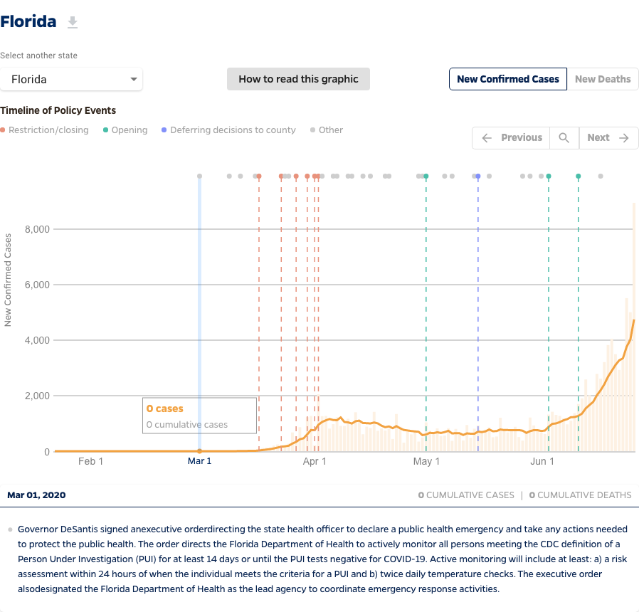
A quick reminder from our previous discussion. Another feature of every graph that I asked you to notice was the area under the curve. In this plot the area under the curve is the total number of cases between any two dates. Look at the area under the curve between April 1 and May 1. Now compare that to the area under the curve for June. I think you would have to agree that there have been more cases in June than in April though at worst maybe twice as much. But there's a difference, if you imagine what might happen in July. July will start with somewhere around 4000 cases/day and even if Florida manages to stop the increase in the number of daily cases there is little evidence that it will drop quickly. That suggests that July is going to be a very important month to watch for Florida and it is likely to be very challenging for them.
There are no straight lines here. What we do is drawn a line on the graph that matches the slope at the point on the graph we are interested in. When I am at my desk I often do this by printing the graph and then using a ruler to draw a line which seems to best replicate the slope of the graph that I am interested in. Sometimes I lay the edge of a piece of paper on my computer screen so it matches the graph. In this case I annotated the graph on my screen to indicate the straight line.
Here is a detail of the graph.
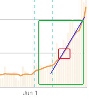
The green box is roughly the second week of June, the red box is the middle of that week, and the blue line matches the slope of the orange line at that point. The blue line crosses the gray grid on June 13 and again on June 22 (if I counted right). Looking back at the previous plot those gray lines are 2000 cases/day (lower line) and 4000 cases/day (upper line). That means my two points on the blue line are [13 days, 2000 cases/day] and [22 days, 4000 cases/day]. The math looks like this....
slope = rise/run = [4000 - 2000 cases/day]/[22 - 13 days] = 222 cases/day/day
This is a statement that the rate of change of the daily cases is increasing by 222 cases/day every day at that time. Be sure to look at the units to see where I got them.
Let's compare that to the slope back at the end of March or begining of April. Here's the plot detail....
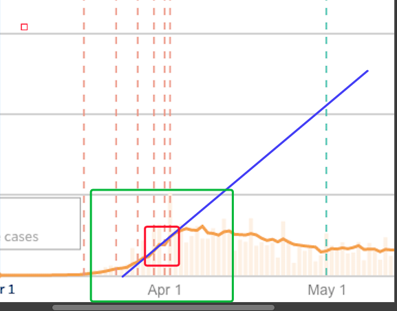
Again I pick my two points where the blue line crosses the gray lines. I get 4000 cases/day on April 28 and 2000 cases/day on April 11. NOTICE: The actual data never touches those points but the do describe the slope of the blue line which tracks the data around the last couple of days of March. When I do the math I get a slope of 118 cases/day/day. This is about half what it is in the middle of June. You will note that back at the end of March the rate of new cases slowed down and in June there is no sign yet that the growth in the new cases is slowing down. Yikes.
How does this apply to our Robots?
One of the things we will eventually do with our Ultrasonic ranger is measure the distance to a wall as we drive towards it. Those two data points can tell us how fast our Qbot is going. Hopefully we'll be able to finish the calculation before we run into the wall.
Other Examples:
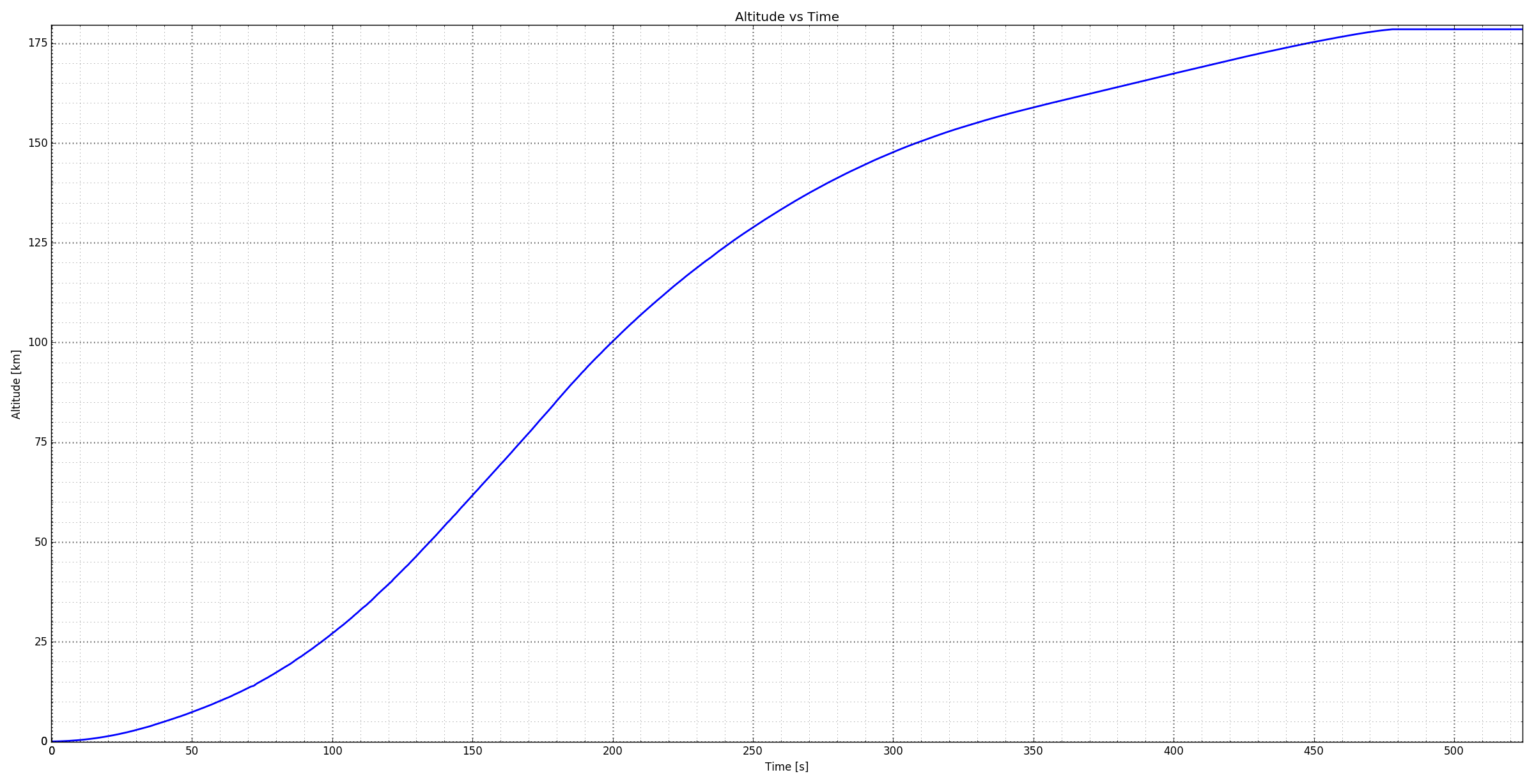
Here's the data from a Space X test launch. You will need this for one of the homework problems
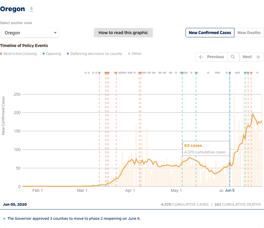
Here's another relevant data set...for Oregon.
Assignment Breadcrumb Reading: Bb Assignment
Growth in Daily Cases:
Given that the slope of the new daily cases in Florida in the middle of June (222 cases/day each day) is about twice what it was at the end of March (118 cases/day each day) should Floridians be more worried, less worried, or about the same as they were back in late March? Explain your answer based on the data you see on the plot and our calculated slopes.
Before Next Class:
Assignment HW: Bb Quiz
Falcon Speed:
The Space X data for a Falcon test launch is shown above. Use to tools we discussed here to determine the slope of the curve at 50 s and 150 s. Your units when you finish will be km/s which is the speed of the rocket. You could print the graph on a piece of paper to do the assignment but you could also (gently) lay a straight edge on the image on your screen and pick two points on the line that way. The quiz is only asking you for your answer and I will be generous about the variability because we will all draw slightly different lines.
Assignment HW: Bb Quiz
Oregon COVID:
Above is the Oregon COVID case data through 6/27. Calculate the slope of the curve the last week of March and the second week of June. It's tough to compare two states like Oregon and Florida because they have very different populations. Oregon has a population of 4 million (40 x 100,000 = 40*105) while Florida has a population of 22 million or 220*105. If you divide your Oregon slopes by 40 and our Florida slopes by 220 you get the rate of increase per 105 people. It's not a perfect comparison but it does suggest which state is being more challenged. You will be asked for these population corrected slopes in the quiz.
Looking Ahead:
Look ahead to the next Breadcrumb: Sensor I
Assignment Breadcrumb Reading: Bb Quiz
Can you see/hear?
Refer to the images in the Breadcrumb. Can I see light that has a wavelength of 1 μm and can I hear sound that has a frequency of 10 Hz?
