In the course of this lab you will be introduced to a number of concepts associated with the presentation and analysis of data. Today's data is known as 1 dimensional data -- that is to say, all the information you are interested in is contained in a single number for each measurement. The mass of a single bead for instance. If you were interested in the mass and the thickness of each bead then you would be collecting 2 dimensional data. If you find the mass, length, and chemical composition of each bead then you have three dimensional data. In each case there are different techniques for presenting and analyzing the data points.
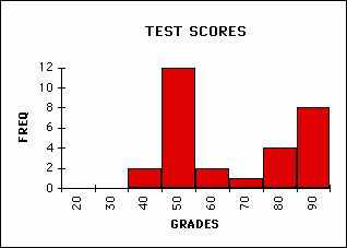
A particular kind of plot called a histogram is a classic way of representing 1 dimensional data. Histograms show how many data points fall in a particular range of values. This is sometimes called a frequency plot. A histogram that you have all seen is the plot that shows how many students got what grades on a test. As you can see in the following examples the height of the bar indicates how many students received grades in the indicated range.
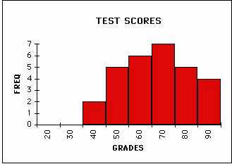 |
NORMAL SET OF GRADES
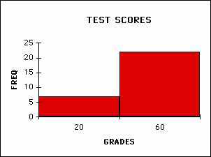 |
LARGE BINS FOR SAME GRADES
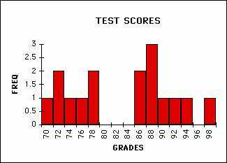 |
SMALL BINS FOR SAME GRADES
You will note that how I choose to divide up the range significantly affects the usefulness of the plot. Think about how you perceive these differences. If you divide up the range too finely then some of the patterns are lost while if you divide too coarsely things are even worse. Making a good choice of histogram divisions (also known as bins) is crucial to presenting and analyzing the data.
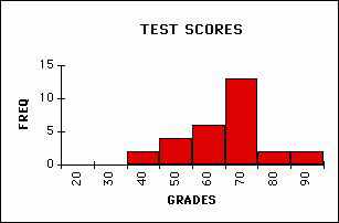
Once you have a workable histogram you need to identify its features. Identify the following features in the example below: minimum score, maximum, average (or mean), and median (half of the scores below and half above). These pieces of information tell a great deal about the data. This is the kind of information we are used to getting about a set of data but it does not always tell the whole story. Below is another histogram which has the same min, max, mean, and median. What is the difference between these two distributions?
 |
CENTERED GRADES
 |
SPREAD GRADES
In qualitative terms the difference is called the variability of the data. Variability is a tough concept to define mathematically because we mean many different things when we use this word. Our intuitive assumption that we have been trained to believe is that the most probable value in a set of data is the same as the mean (average) value. We are also trained to believe that most of the data will have values quite close to the mean value. As you can see this is not always the case.
There are mathematical ways of defining and measuring the variability of a data set. What I am concerned about is whether you can look at a set of data and intelligently discuss how much variability you observe. It is important to consider the variation of the data in the context of the mean value. For instance, if you weigh 100 elephants and find that their weights vary 10 kg from the mean that is very different from weighing 100 cats and finding that their weights vary 10 kg from the mean. In concrete terms this means that when you are asked to discuss the variability of your data in an experimental setting you will need to consider several factors. These include the most probable value, the mean value, and the distribution of the data values.
The second distribution above is technically known as a `bimodal' distribution because of the two peaks in the distribution. Even though it shares many features of the previous distribution (like it's mean, min, max etc.) it shows a higher degree of variation. A mathematical measure of this variability is called the standard deviation. The standard deviation measures how far each data point is from the mean of the distribution. This suggests that the standard deviation (often abbreviated σ (sigma)) will be smaller for the centered distribution. While the standard deviation is a mathematically defined quantity we will not initially concern ourselves with its rigorous mathematical definition given below.

What I would like you to understand is a more experiential
definition of this quantity. In each of the distributions above there are
roughly 30 students with a class grade average of roughly 75. How wide would
I have to make my bins, centered around the mean of the data, so that 70%
of the data was in the central bin? Half the width of this huge bin is a good
estimate of the standard deviation. I know this is a bad bin choice from a
communication point of view but it is tied, in fact, to the conceptual meaning
of the standard deviation.
Lets apply this idea to the data shown above. There are 30 data points in each set so my goal is to find a bin width that includes around 20 data points in the center bin (remember the bin is centered on the mean value of the distribution. Assuming that the mean value is 70 in each case if I take a bin width of 20 (from 60 - 80) I have 19 data points inside this bin in the first case and only 3 data points in the second case. This implies that the standard deviation in the first case is a little above 10 pts (i.e. 20/2) and we're not even close in the second case. In the second case I have to take a bin width of 40 (50 - 90) to get 19 data points inside the central bin. This suggests that the standard deviation is around 20 pts (i.e. 40/2) and supports the idea that the second histogram shows a lot more variability.
Here's image that is essentially saying the same thing in a more rigorous way.
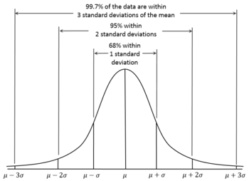
This 70% criterion is an excellent estimate of the standard deviation of a set of data. It is also inportant to recognise that the most reliable part of your data set occurs within one standard deviation of the mean. Throughout the year when I ask for an estimate of your variability in an experiment this is the criterion I would like you to use. You are, of course, free to use the formal determination as well but I will expect you to be able to eyeball the standard deviation from a distribution without grabbing for your calculators.
