You are quite used to seeing what are called x-y plots. This is an example of data (x and y) which are plotted as pairs on a Cartesian grid. In most cases this is done to determine if there is a mathematical relationship between x and y. In some cases the data form a straight line. Such a plot indicates a very predictable relationship that is easy to write down! As we consider other interesting variables we can also plot them as pairs on a Cartesian grid. If we observe some kind of regularity in the plot then we have found a relationship. In the following plot of pressure and depth two different sets of data form straight lines. Each line indicates a different predictable relationship
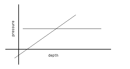
between the variables. One is quite simple: The pressure stays the same regardless of depth. The other seems slightly more realistic: The pressure increases linearly with depth. The data do not always show such simple relationships. Consider the following plot which shows two other sets of data relating pressure and depth.
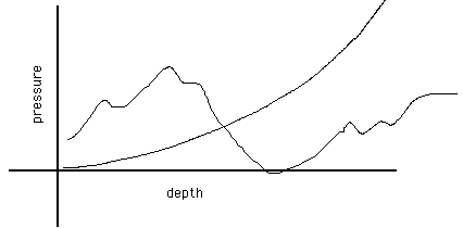
In this plot neither data set indicates a linear relationship (note that linear implies a straight line!). Nonetheless we can clearly see a smooth relationship between pressure and depth in one of the cases. Verbally it would be stated: The pressure increases geometrically, or possibly exponentially, with increasing depth. In this statement the words geometrically and exponentially have precise meanings which can be tested by carefully analyzing the plot. The other data set illustrated shows no apparent predictable relationship between the two variables. If confirmed it means that there is no simple connection between the pressure and the depth. You must be careful: It is not certain from such erratic data that no connection exists, just that if it does, it is going to be complex.
In cases where the data shows a linear relationship between the variables the slope of the line often has physical significance. One way to try and spot the physical meaning of the slope is to consider the units of the slope. In other cases just verbalizing what the slope represents can give you a clue. When there is an apparent relationship between variable that is not linear then we need additional tools to figure out what the mathematical relationship is.
Motion Plots:
In this lab we will be exploring how we can represent the motion of an object as a position vrs time plot. We have already explored the process of creating motion diagrams to describe the motion of an object. In these pictures we have to rely on the fact that the indicated positions are separated but the same increment of time. While this is conceptually easy to do it is difficult to collect data at absolutely uniform time intervals. More commonly data is taken at specific positions in space and the time the object arrives at that position is recorded. What we need is a way to relate these two equivalent data types.
If we take data that represents the position of a object and the time it was at that position we have two dimensional data which we can plot on a Cartesian grid. In the following plot we have data which lies along a straight line even though the data points are not uniformly distributed. If I now ask, "Where was the object 1s, 2s, 3s, etc. ?" the
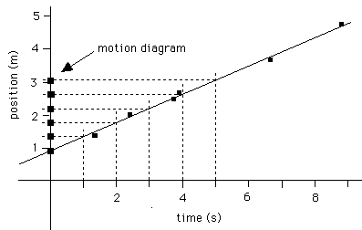
plot will tell me the answer. Find the 1s label on the horizontal axis and follow it up until it intersects the straight line. Then turn and look left until you intersect the vertical axis of your plot. Where you intersect the vertical (position) axis tells you where your object was at t=1s. If you repeat this process at intervals of 1s you will find the location of your object at uniform time intervals. From this you can create an accurate motion diagram. You can also reverse the process to create an x-y plot from a motion diagram.
For those of you who enjoy conceptual challenges you might consider the result of inverting this process in the following way. Pick uniform intervals in position (i.e. 1m, 2m, 3m, etc) and project them across and down to the time axis. The collection of points marking the intersections with the time axis look like a motion diagram in some ways. Does the diagram have the same interpretation or is it a new beast?
So, the process is a bit different if you are trying to construct a motion diagram from a v vrs t plot. Consider the same plot as shown previously with different labels on the axes.
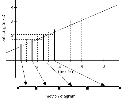
The information we need to extract from the plot is velocity at regular intervals of time. Once again we determine this by projecting up from the time axis until we intersect the plot and then track horizontally until we meet the velocity axis. The distance along the velocity axis is proportional to the velocity and is therefore proportional to the distance between blocks on the motion diagram. The graphical technique shown above will work very effectively if you like using rulers. Be sure to work on visualizing the motion of the object being represented so that this does not become simply a mechanical process devoid of meaning.