Wind:
Reading to date:
At this point you have hopefully read the chapter on Wind:Tech from David's book before we start this discussion. This is a dense chapter that explores the basics of wind power.
Payback Time:
What is payback time? What is a reasonable length of time to wait to recover your investment? How does this connect with big ticket items like cars and houses?
 3 years
So how do we go about figuring this out? Let's start with Shepards Flat. The wind farm produces 2000 GWh annually using 338 wind turbines. How much energy does this mean each wind turbine produces at the farm?
 5.9 GWh
If we rewrite this in kWh we can get a sense of the value of the electrical energy produced annually. Let's start by assuming that we can recover a typical retail value ($0.10) for the energy. What is it worth? What if we can only get $0.03 which is more like the value of base power? What if the wind farm get's an extra $0.05 for generating 'green' power?
We can get a sense of wind turbine costs from this Renewables First web page (still reasonable in 2020). It's interesting to note that they have a rough estimate of overall costs relative to just the wind turbine (70% for turbine). Here's a quick currency converter if we need it. How to we figure out the total cost to install a 2.5 MW wind turbine?
This gives us a range of possible payback times depending on what the energy is worth. In the worst case it might be around 14 years. In the best case it might be closer to 5-6 years. Once it's paid off each of those turbines at Shepards flat are producing at least a few hundred thousand $$ a year.
Realities:
The data from 2012 when the subsidies went away and all wind farm production stopped is an interesting data point. Since 2012 the wind power industry has gained experience and the costs have fallen. The subsidy for wind power peaked in 2016 and is being reduced by 20%/yr making it set to expire in 2020. We will see if it impacts the rate of construction of new wind projects. The Annenberg fact checking project finds that an honest comparison suggests that wind power (particularly offshore installations) can be cheaper than natural gas power plants without relying on the subsidy. The question of the intermittency of the wind we will address in a moment.
Capacity Factor:
A consistent feature of all renewable energy sources is that they are at least somewhat intermittent. This means that a power plant designed to produce at a rate of 1 MW will produce something less than this maximum. The ratio of the rate at which energy is actually generated to the maximum possible energy generation is what we call the capacity factor which is always something less than 100%. Imagine we put a 1 MW wind turbine at Shepard's Flat and it ran at full capacity all year. It would produce 8760 MWh of energy (1 MW x 8760 hr). 1 MW is called the nameplate capacity of the wind turbine. If the turbine actually produced 3000 MWh of energy then the capacity factor would be 3000 MWh/8760 MWh = .34 or 34%.
Let's look are our actual example. The nameplate capacity at the Shepards Flat Wind Farm is 845 MW (for 338 wind turbines). This means the maximum possible energy generation is...
845 MW x 8760 hr/yr = 7402 GWh/yr
The actual energy generation was 2000 GWh/yr. Taking this ratio we get the capacity factor which is ....
(2000 GWh/yr)/(7402 GWh/yr) = capacity factor = 27% (.27)
Traditional power plants operate at roughly 90% capacity due to down time for maintenance. What this means for the community is that the actual power generation of a wind farm is typically 1/4 of its rated or nameplate capacity.
HW: Wind Tech
Returning to the Blue Canyon wind farm in the previous HW what is the capacity factor for this wind farm? Even though the power density (W/m2) for this wind farm was low the capacity factor is typical. How can this be?
Wind Speed vrs Power:
Here's a power curve for a typical 2.5 MW turbine like those at Shepard's Flat. Looking at the wind map of Oregon we see that Shepard's Flat has an average wind speed of 7 m/s. How much power does the wind turbine generate at that wind speed? How much energy does that suggest it would produce in a year? Why do these numbers not quite line up?
 9.6 GWh
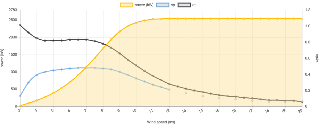
This inconsistency is due to the v2 effect that we discussed in a previous breadcrumb. Because the energy available in the wind is NOT linearly dependent on the wind speed the average wind speed doesn't acurately represent the average energy generation.
HW: Wind Tech
In the power curve for the 2.5 MW wind turbines at Shepards Flat there is a minumum wind speed that will below which the turbine doesn't operate. This speed is called the cut off speed. What is the cut off wind speed for this turbine? What is the wind speed at which the wind turbine reaches it's maximum output? Why do you think the power output is consistent after that when the faster winds have more energy?
Energy Demand:
California maintains a lovely public database that allows us to watch the demand for power in nearly real time. Recently that added information that allows us to see the impact of solar and wind generation on the supply side. Here is a link to the daily outlook webpage which we will visit often. Lets start by digging back into the winter of 2020. Throughout the winter there is a typical 'double humped' shape. Look at the times and consider what human patterns lead to this use pattern.
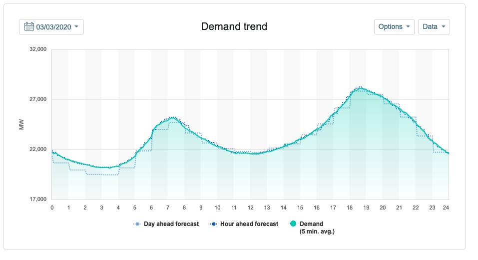
Use your graphical interpretation skills to explore this graph. Note that the bottom of the vertical scale is 17 GW which means 0 is a long way down. An important recognition is that (at this time of year) California needs 17 GW of continuous energy generation capability. This underlying consistent need is called base load. When the demand curve goes up various power plants have to ramp up to provide the power and when the demand recedes then the power plants ease up.
How Does Wind Fit In?
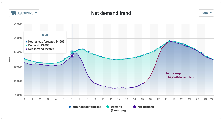
Below is the net demand curve for the same day. The net demand is the total demand minus solar and wind energy that is generated. Notice how much of the demand curve during the day is filled by renewable sources. Even at night there is a consistent (though not steady) contribution from renewable energy. Presumably the night time stuff is mostly wind which varies somewhat. Most of the daytime stuff is solar which is more predictable and consistent. Notice that on this particular day wind provided energy in the early hours of the day but had died down and produced almost nothing in the evening. Power managers must use other power resources to fill the gap to meet the demands of the community. As the wind changes other power plants must adjust which is a bit aggravating for the power managers.
Consider A Summer Day:
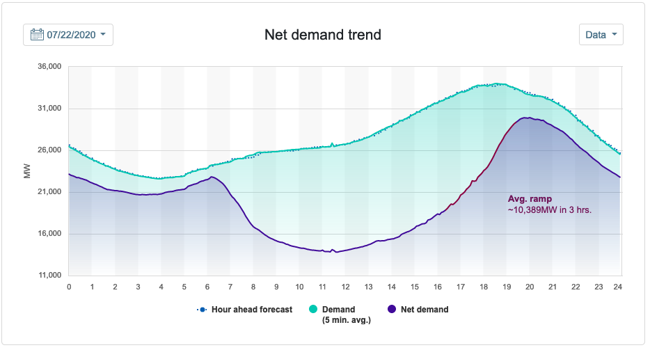
What do you notice is different about this demand curve for a summer day (it's about the same as pre-COVID)? Can you think of reasons for the differences?
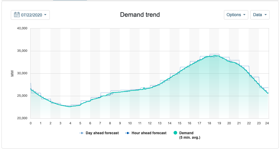
Here is the net demand for that day. Does it seem like this is a windy day or not in California?
HW: Wind Tech
What is it about energy use in California in March 2020 that leads to the double bump shape of the demand curve? Why do you think that feature of the demand curve is gone during in July 2020 (it's not COVID)? What percentage of the power generation needs was met by solar energy in the two cases (remember to subtract wind generation which will be an estimate)?
HW: Wind Tech
Complete and assemble your solutions to all the HW problems (3) listed here showing all the steps in your solutions. Scan to a pdf and turn in on LMS. Please review HW format expectations for guidance about your homework solutions.
Reading Ahead:
No new reading for next time -- we're going to go a little deeper still.
